Table of contents
Difference between plt and fig,ax
object-oriented
Inverse the X-axis
|
|
Add caption below the x-label
-
1 2 3fig, ax = plt.subplots() txt = 'near and far are distance' fig.text(x=.5, y=.001, s=txt, ha='center')
|
|
微分柱形图

Set xticks
xticks is the (fixed) number on the x-axis, while xticklabels can be customized strings.
-
For plt (
Matplotlib.pyplot.xticks()): Matplotlib Set_xticks - Detailed Tutorial - Python Guides -
Matplotlib.axes.Axes.set_xticklabels()Matplotlib Set_xticklabels -Python Guides1 2 3fig, ax = plt.subplots() ax.set_xticks([0, np.pi, 2*np.pi, 3*np.pi]) ax.set_xticklabels(labels=['0', r'$\pi$', r'2$\pi$', r'3$\pi$'], fontdict=None, fontsize=6, fontstyle='italic', color='red', verticalalignment='top', horizontalalignment='left', rotation=90, minor=True,
Change the number and text of the showing Ticks
-
For
plt:1 2plt.xticks(ticks=[1,2,3,4], labels=None, **kwargs) plt.yticks(ticks=[7,13,24,22], labels=None,) -
Use
locator_param()to change the tightness and number of ticks.plt.locator_params(axis='both', nbins=4) -
Use
xlim()to restrict the diplayed area, rather the whoel plot.1 2plt.xlim(0,3) plt.locator_params(axis='x', nbins=3) -
Use
Matplotlib.ticker.MaxNLocatorclass
Set Number of Ticks in Matplotlib | Delft Stack
|
|
Set y-axis view limits
Matplotlib.axes.Axes.set_ylim() in Python - GeeksforGeeks
|
|
Set the 1st x as 1 (not 0)
Python MatplotLib plot x-axis with first x-axis value labeled as 1 (instead of 0)
Ticks
Add extra ticks, labels
-
Add extra ticks which must be number, not work for string SO
1 2 3fig, ax= plt.subplots() extraticks = [2.1, 3, 7.6] ax.set_xticks(list(ax.get_xticks()) + extraticks) -
Use
ax.set_xticklabels()for string Create label list - SO1 2 3 4 5near, far = 1, 15 ax.set_xticks(list(ax.get_xticks()) + [-near,-far]) # Their labels also have to be appended at the end. xticklabels= ['-16', '-14', '-12', '-10', '-8', '-6', '-4', '-2','0', '-near', '-far'] ax.set_xticklabels(xticklabels, rotation=90)
Example: Mark the yticks for the highest and lowest points:
|
|
-
Example: 把新 ticklabel 加入并重新排列
-
References:
-
-
Replace xticklabels
-
References:
-
Supports:
(2025-08-22T12:55)
-
Rebuild the label list
1 2 3 4 5 6 7 8 9 10 11# 3. Define the desired tick locations and get their labels # The x-values where you want to place ticks new_locations = [5, 15, 20, 25, 30] # Get the corresponding labels directly from the DataFrame using a list comprehension # This assumes the index of the DataFrame corresponds to the x-values of your plot new_labels = [df[df.columns[0]][loc] for loc in new_locations] # 4. Set the new ticks and labels on the plot ax1.set_xticks(new_locations) ax1.set_xticklabels(new_labels, rotation=90) # Use rotation to prevent labels from overlapping
-
-
Set xticks as integer
(Not sure) ax.xaxis.set_major_locator(MaxNLocator(integer=True))
-
Python:使用f-string保留小数点位数 csdn
-
用decimal 模块:w3cschool
1 2 3from decimal import Decimal a = 12.345 Decimal(a).quantize(Decimal("0.00")) # 使用默认的进位方式(同round)“0.00”表示保留小数点后两位
Hide ticks
-
Remove ticks
-
References:
-
Supports:
-
Remove tick labels by setting them to an empty list r1-GfG
1 2fig, ax1 = plt.subplots(1,1) ax1.set_xticks([])
-
-
Set tick bold, color
(2024-08-04)
-
Set an individual xtick label to be bold:
1ax.get_xticklabels()[label_ls.index("Input point cloud")].set_weight('bold')- Ref: How to set the matplotlib axes tick labels fontweight to bold? - SO (Searched by “python matlibplot.pyplot xtick label bold” in DDG)
-
Set ticklabel color
-
References:
-
Supports:
(2025-08-11T22:40)
ax.get_xticklabels()[2].set_color('red')
-
Fontsize of yticks
References:
-
- Asked ChatGPT
-
Set the fontsize of numbers, not labels for yticks:
1 2 3 4x = [1, 2, 3, 4] y = [1e6, 2e6, 2.5e6, 3e6] fig, ax = plt.subplots() ax.tick_params(axis='y', labelsize=14) -
Set font size for the scale factor (offset text) in the scientific notation
1 2 3 4 5 6 7 8 9 10 11 12 13import matplotlib.pyplot as plt x = [1, 2, 3, 4] y = [1e6, 2e6, 2.5e6, 3e6] fig, ax = plt.subplots() ax.plot(x, y) # Enable scientific notation on the y-axis ax.ticklabel_format(axis='y', style='sci', scilimits=(-2, 2)) # Set font size for the scale factor (offset text) ax.yaxis.get_offset_text().set_fontsize(14) plt.show()
Margin
to leave more space around the figure to show the ticks of the boundary Geeksforgeeks
Or prevent the markers get clipped by the axes GfG plt xticks
|
|
Legend
References:
- gfg
- Docs
- How to add legend below subplots in matplotlib? - SO
-
How to specify legend position in graph coordinates - SO
- Searched by
python matplotlib ax.legend specify positional coordinatesin DDG
- Searched by
Notes:
-
Set legend to ax:
1 2ax.plot([1, 2, 3], label='Inline label') ax.legend(loc='best', bbox_to_anchor=(0.5, 0., 0.5, 0.5)) -
Put it below the subplots r3-SO:
1 2ax.legend(loc="upper center", bbox_to_anchor=(0.5, -0.13), fancybox=False, shadow=False, ncol=5, fontsize=6)
(2024/12/04)
-
Specify the accurate posistion of legend r4-SO:
1ax.legend(loc=(0.25, 0.67))1is for the right-bottom corner of the legend at the top edge of the plot.
Draw a horizontal line
-
plt : gfg
1plt.axhline(y=0.5, color='r', linestyle='-') -
ax: SO
1ax.hlines(y=0.2, xmin=0.01, xmax=20, linewidth=2, color='r')
Tight layout
|
|
- Or:
plt.rcParams["savefig.bbox"] = 'tight'
(2024-07-23)
-
Or:
1 2 3 4 5fig, ax = plt.subplots() fig.tight_layout() ax.set_title("Tweaking points within triangle", fontsize=16) ax.set(xlim =(0, 2.5), ylim =(-1.25, 0.5))
Save as png
|
|
Draw markers on axes
plt.plot(x,y, zorder=10, clip_on=False)
plotting markers on top of axes
Arrow of axis
Change fonts
Plot in Ubuntu has ugly fonts (which is like ‘sans-serif’).
plt.rcParams["font.family"] = "cursive",
This will change to your computer’s default monospace font.
How to change fonts in matplotlib (python)?
散点图
-
plt.scatter(x,y, c='r', s=4), s can control marker size, docs -
marker 是反着画的
-
matplotlib.pyplot.scatter(x, y, s=None, c=None, marker=None, cmap=None, norm=None, vmin=None, vmax=None, alpha=None, linewidths=None, verts=None, edgecolors=None, hold=None, data=None, **kwargs)
x,y组成了散点的坐标;s为散点的面积;c为散点的颜色(默认为蓝色’b’);marker为散点的标记;alpha为散点的透明度(0与1之间的数,0为完全透明,1为完全不透明);linewidths为散点边缘的线宽;如果marker为None,则使用verts的值构建散点标记;edgecolors为散点边缘颜色。 csdn
拉长坐标间距
Python设置matplotlib.plot的坐标轴刻度间隔以及刻度范围
|
|
设置图片尺寸大小
如何指定matplotlib输出图片的尺寸? - pythonic生物人的回答 - 知乎 https://www.zhihu.com/question/37221233/answer/2250419008
-
plt.rcParams['figure.figsize'] = (12.0, 8.0) -
fig, ax = plt.subplots(figsize=(15,0.5),dpi=300)pool
设置图片分辨率
plt.figure(figsize=(a, b), dpi=dpi)
网格
plt.grid(visible=True,linestyle="--", color='gray', linewidth='1',)
绘制CDF (221211)
Repeat drawing
How to change a matplotlib figure in a different cell in Jupyter Notebook?
|
|
(2022-12-13)
Get the arguments name
use lib inspect with two .f_back:
callers_local_vars = inspect.currentframe().f_back.f_back.f_locals.items().
Getting the name of a variable as a string
Get current color
plt.gca().lines[-1].get_color()
-
use ax Get default line colour cycle
1 2line = ax.plot(x,y) ax.plot(x, y+.3, color = line.get_color())
多曲线
Combine two figures
Multiple subplots
-
1 2 3 4 5 6 7fig, ax = plt.subplots(3, 3) # draw graph for i in ax: for j in i: j.plot(np.random.randint(0, 5, 5), np.random.randint(0, 5, 5)) plt.show() -
title of subplots:
ax[0][0].set_title("xxx") -
hide x ticks for top subplots and y ticks for right plots: How to set a single, main title above all the subplots with Pyplot?
1 2plt.setp([a.get_xticklabels() for a in axarr[0, :]], visible=False) plt.setp([a.get_yticklabels() for a in axarr[:, 1]], visible=False) -
Set xticks for subplots: How to set xticks in subplots
1 2 3 4 5 6 7 8 9 10 11 12fig, axes = plt.subplots(nrows=3, ncols=4) # Set the ticks and ticklabels for all axes plt.setp(axes, xticks=[0.1, 0.5, 0.9], xticklabels=['a', 'b', 'c'], yticks=[1, 2, 3]) # Use the pyplot interface to change just one subplot... plt.sca(axes[1, 1]) plt.xticks(range(3), ['A', 'Big', 'Cat'], color='red') fig.tight_layout() plt.show() -
Set the fontsize of numbers of xticks:
plt.setp(ax.get_xticklabels(), fontsize=12, fontweight="normal", horizontalalignment="left", rotation=90)set_xticks() needs argument for ‘fontsize’ #12318
set_xticklabels-Docs
多曲线不同尺度
-
Three lines with different ranges
-
References:
-
Supports:
(2025-08-11T14:56)
-
ax.twinx()r1-Gemini1 2 3 4 5 6 7 8 9 10 11 12 13 14 15 16 17 18 19 20 21 22 23 24 25 26 27 28 29 30 31 32 33 34 35 36 37 38 39 40 41import matplotlib.pyplot as plt import numpy as np # Generate some sample data x = np.linspace(0, 10, 100) curve1 = 990 + 410 * np.sin(x) # Range: 990 - 1400 curve2 = 4 + 6 * np.cos(x) # Range: -2 - 10 curve3 = 9 + 11 * np.sin(x+1) # Range: -2 - 20 # Create a figure and a primary axes object fig, ax1 = plt.subplots(figsize=(10, 6)) # Plot the first curve on the primary y-axis color = 'tab:red' ax1.set_xlabel('X-axis') ax1.set_ylabel('Curve 1', color=color) ax1.plot(x, curve1, color=color) ax1.tick_params(axis='y', labelcolor=color) # Create a second y-axis that shares the same x-axis ax2 = ax1.twinx() color = 'tab:blue' ax2.set_ylabel('Curve 2', color=color) ax2.plot(x, curve2, color=color) ax2.tick_params(axis='y', labelcolor=color) # Create a third y-axis ax3 = ax1.twinx() color = 'tab:green' ax3.set_ylabel('Curve 3', color=color) ax3.plot(x, curve3, color=color) ax3.tick_params(axis='y', labelcolor=color) # To prevent the third y-axis from overlapping with the second, we need to move it to the right. ax3.spines['right'].set_position(('outward', 60)) fig.tight_layout() # otherwise the right y-label is slightly clipped plt.savefig("three_curves_plot.png") plt.close()
-
-
Scale y-axis
-
Log scale
-
References:
-
Supports:
-
plt.yscale
1 2 3 4x = np.arange(len(Train_RMSE)) fig, ax = plt.subplots() plt.yscale('log',) ax.plot(x, Train_RMSE)
-
-
-
Scale
-
Problems:
- Make the line only take the middle 50% y-range of the canvas.
-
References: {{{
-
Supports:
(2025-08-22T13:57)
-
Input
1 2 3 4 5 6 7 8 9 10 11 12 13 14 15 16 17 18 19 20 21 22 23 24 25 26 27 28 29 30 31 32 33 34 35 36 37 38 39 40 41 42 43 44 45 46 47 48 49 50 51 52 53# === # === Scaling the Line to the Middle 50% # === import matplotlib.pyplot as plt import matplotlib.ticker as mticker from fractions import Fraction import numpy as np # --- 1. Original Data --- x = [1, 2, 3, 4, 5] y = np.array([0.65, 0.72, 0.78, 0.71, 0.68]) # --- 2. Define Canvas and Target Ranges --- # The full y-range you want to see on the plot canvas_min, canvas_max = -2, 6 # The middle 50% of the canvas range canvas_range = canvas_max - canvas_min target_min = canvas_min + 0.25 * canvas_range target_max = canvas_max - 0.25 * canvas_range # --- 3. Scale the Data --- data_min, data_max = y.min(), y.max() data_range = data_max - data_min target_range = target_max - target_min # Normalize data to a 0-1 scale, then scale to the target range y_scaled = (((y - data_min) / data_range) * target_range) + target_min # --- 4. Create an Inverse Formatter for Labels --- def inverse_scale_formatter(scaled_val, pos): """ Takes a scaled value from the y-axis and converts it back to its original data value for display as a label. """ # Inverse normalization from target range back to 0-1 normalized_val = (scaled_val - target_min) / target_range # Inverse scaling from 0-1 back to the original data range original_val = normalized_val * data_range + data_min # Format as a fraction return f'{Fraction(original_val).limit_denominator()}' # --- 5. Create and Format the Plot --- fig, ax = plt.subplots(figsize=(8, 6)) # Plot the SCALED data ax.plot(x, y_scaled, marker='o', color='purple') # Set the y-axis limits to the full canvas range ax.set_ylim(canvas_min, canvas_max) # Apply the special inverse formatter ax.yaxis.set_major_formatter(mticker.FuncFormatter(inverse_scale_formatter))
-
-
Composite 2 imgs
(2023-12-20) Setting alpha:
|
|
An example
|
|
3D interactive plot
(2024-03-23)
Make 3D interactive Matplotlib plot in Jupyter Notebook - GfG
-
3D Scatter plot:
Code
1 2 3 4 5 6 7 8 9 10 11 12 13 14 15 16 17 18 19 20 21 22 23 24 25 26 27 28 29 30 31 32# for creating a responsive plot %matplotlib widget # importing required libraries from mpl_toolkits.mplot3d import Axes3D import matplotlib.pyplot as plt # creating random dataset xs = [14, 24, 43, 47, 54, 66, 74, 89, 12, 44, 1, 2, 3, 4, 5, 9, 8, 7, 6, 5] ys = [0, 1, 2, 3, 4, 5, 6, 7, 8, 9, 6, 3, 5, 2, 4, 1, 8, 7, 0, 5] zs = [9, 6, 3, 5, 2, 4, 1, 8, 7, 0, 1, 2, 3, 4, 5, 6, 7, 8, 9, 0] # creating figure fig = plt.figure() ax = fig.add_subplot(111, projection='3d') # creating the plot plot_geeks = ax.scatter(xs, ys, zs, color='green') # setting title and labels ax.set_title("3D plot") ax.set_xlabel('x-axis') ax.set_ylabel('y-axis') ax.set_zlabel('z-axis') # displaying the plot plt.show()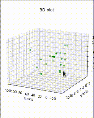
-
3D Bar plot:
Code
1 2 3 4 5 6 7 8 9 10 11 12 13 14 15 16 17 18 19 20 21 22 23 24 25 26 27 28%matplotlib widget from mpl_toolkits.mplot3d import Axes3D import matplotlib.pyplot as plt import numpy as np # creating random dataset xs = [2, 3, 4, 5, 1, 6, 2, 1, 7, 2] ys = [1, 2, 3, 4, 5, 6, 7, 8, 9, 10] zs = np.zeros(10) dx = np.ones(10) dy = np.ones(10) dz = [1, 2, 3, 4, 5, 6, 7, 8, 9, 10] # creating figure figg = plt.figure() ax = figg.add_subplot(111, projection='3d') # creating the plot plot_geeks = ax.bar3d(xs, ys, zs, dx, dy, dz, color='green') # setting title and labels ax.set_title("3D bar plot") ax.set_xlabel('x-axis') ax.set_ylabel('y-axis') ax.set_zlabel('z-axis') plt.show()
Camera Poses
(2024-03-23)
Generate by ChatGPT with prompt: “How to plot multiple camera poses in a single figure?”
Code
|
|

3D arrow
(2024-03-23)
Putting arrowheads on vectors in a 3d plot - SO
Code
|
|

Convex polygon on 2D
(2024-03-26)
How to fill an area within a polygon in Python using matplotlib? - SO
Example from Scipy:
|
|

Fill 3D Polygon
(2024-03-26)
ax.fillis used for 2D, and doesn’t work for 3D.
-
ax.add_collection3dcannot follow the counter-clockwise order of convex hull to fill the polygon. For example, when drawing a rectangle, it will fill 2 triangles:1 2 3 4 5 6 7 8 9 10 11 12 13 14%matplotlib widget import numpy as np import matplotlib.pyplot as plt from mpl_toolkits.mplot3d import Axes3D from mpl_toolkits.mplot3d.art3d import Poly3DCollection fig = plt.figure() ax = fig.add_subplot(111, projection='3d') verts = np.array([[ [0,0,0], [1,0,0], [0,1,0], [1,1,0] ]]) # (1,4,3) rec = Poly3DCollection(verts, alpha=0.5, facecolors='cyan', edgecolors='k') ax.add_collection3d(rec)- The
Poly3DCollectioncode is generated by ChatGPT with prompt: “How to fill a 3D triangle with matlabplot”

- The
-
So, I draw 2 triangles to form a quadrilateral:
1 2 3 4 5 6 7 8 9 10 11 12 13 14 15 16 17 18 19%matplotlib widget import numpy as np import matplotlib.pyplot as plt from mpl_toolkits.mplot3d import Axes3D from mpl_toolkits.mplot3d.art3d import Poly3DCollection fig = plt.figure() ax = fig.add_subplot(111, projection='3d') verts = np.array([[ [0,0,0], [1,0,0], [0,1,0],]]) tri = Poly3DCollection(verts, alpha=0.5, facecolors='cyan',) ax.add_collection3d(tri) verts = np.array([[ [1,0,0], [0,1,0], [1,1,0] ]]) tri = Poly3DCollection(verts, alpha=0.5, facecolors='cyan',) ax.add_collection3d(tri)
Project 3D point onto plane
(2024-03-26)
How to project a point onto a plane in 3D? - SO
-
The distance from 3D point to the plane: dot product for 3D point and plane normal vector.
-
3D point minus the distance, resulting in the projection.
Code
|
|

Set line color & marker
(2024-07-23)
-
Set the line to orange and triangle marker:
1edge_1, = axis.plot([0,0], [0,0.5], color='orange', marker='>') -
Set marker appear only at the endpoint:
1seg_2, = ax.plot([0,0], [0,0], color='green', marker='>', markersize='10', markevery=[-1])- Ref: matplotlib: apply marker only to start point or end point? - SO
(
Searched by “python matplotlib pyplot set line marker only for one end” in DDG)
- Ref: matplotlib: apply marker only to start point or end point? - SO
(
-
Set line end arrow
- Use quiver by setting starting point and direction: Arrow on a line plot (Searched by “python matplotlib line arrow” in DDG)
Python 制作动图
(2024-07-23)
-
用 Python 制作程序动画,并保存为 GIF
Ask Claude3.5: “How to use Python to create a GIF image showing a point moving within in a triangle?”
1 2 3 4 5 6 7 8 9 10 11 12 13 14 15 16 17 18 19 20 21 22 23 24 25 26 27 28 29 30 31 32 33 34 35 36 37 38 39 40 41 42 43 44 45import numpy as np import matplotlib.pyplot as plt from matplotlib.animation import FuncAnimation from PIL import Image import io # Define the triangle vertices triangle = np.array([(0, 0), (1, 0), (0.5, np.sqrt(3)/2)]) # Set up the figure and axis fig, ax = plt.subplots() ax.set_xlim(-0.1, 1.1) ax.set_ylim(-0.1, 1) ax.set_aspect('equal') # Plot the triangle ax.plot(np.append(triangle[:, 0], triangle[0, 0]), np.append(triangle[:, 1], triangle[0, 1]), 'k-') # Initialize the point point, = ax.plot([], [], 'ro') # Animation function def animate(frame): t = frame / 100 # Adjust speed # Calculate point position (example: move in a circular path within the triangle) x = 0.5 + 0.3 * np.cos(2 * np.pi * t) y = np.sqrt(3)/4 + 0.2 * np.sin(2 * np.pi * t) point.set_data(x, y) return point, # Create the animation anim = FuncAnimation(fig, animate, frames=100, interval=50, blit=True) # Save the animation as a GIF (Don't work) # frames = [] # for i in range(100): # img_buf = io.BytesIO() # plt.savefig(img_buf, format='png') # img_buf.seek(0) # frames.append(Image.open(img_buf)) # # frames[0].save('moving_point.gif', save_all=True, append_images=frames[1:], duration=50, loop=0) plt.close(fig)
- Saving animated plot as .gif with
PillowWriterdoesn’t work: MovieWriter ffmpeg unavailable; trying to use <class ‘matplotlib.animation.PillowWriter’> instead - SO (Search in DDG)
FuncAnimation
(2024-07-23)
-
Example: Create Animations with FuncAnimation in Python - PythonAlgos (Searched by “python make func animation” in DDG)
1 2 3 4 5 6 7 8 9 10 11 12 13 14 15 16 17 18 19 20 21 22 23 24 25 26 27%matplotlib widget import numpy as np import matplotlib.pyplot as plt from matplotlib.animation import FuncAnimation fig, ax = plt.subplots() #plot sine function _range = np.arange(0, 2*np.pi, 0.001) sine = np.sin(_range) line = plt.plot(_range, sine) ax = plt.axis([0, 2*np.pi, -1, 1]) # The comma is a must, for unpackaging the tuple dot, = plt.plot([0], [np.sin(0)], 'ro') def func(i): dot.set_data(i, np.sin(i)) return dot, _animation = FuncAnimation(fig, func, frames=np.arange(0, 2*np.pi, 0.1), interval=10) _animation.save('sine.mp4', fps=30, extra_args=['-vcodec', 'libx264']) plt.show()-
Saving .mp4 requires:
sudo apt install ffmpeg -
Other Refs:
- More examples: Animations Using Python: A Comprehensive Guide - Medium
- Example of sine wave: Matplotlib.animation.FuncAnimation class in Python - GfG
-
-
Save animation with specifying format (mp4, gif) and dpi: matplotlib.animation.Animation.save - Docs (Found in DDG)
1 2 3 4 5# Save the animation as a mp4 video anim.save('Tweaking_within_Triangle.mp4', writer = 'ffmpeg', fps = 10) # Save the animation as a GIF anim.save('Tweaking_within_Triangle.gif', writer = 'pillow', fps = 10)
Omit frame and ticks
(2024-07-23)
-
Use
transparent=True:1 2plt.axis('off') plt.savefig('imgName',bbox_inches='tight',transparent=True, pad_inches=0) -
Use
fig.subplot_adjust():1 2 3 4 5 6 7 8 9 10 11 12 13 14 15 16 17 18 19import matplotlib.pyplot as plt import numpy as np pixels = 512 px = 1/plt.rcParams['figure.dpi'] # pixel in inches fig, ax = plt.subplots(frameon=False) # Transparent content background fig.set_size_inches(pixels*px, pixels*px) ax = plt.Axes(fig, [0., 0., 1., 1.]) # This is needed for fitting content to 512*512 figure frame otherwise output figure will be less than desired size ax.set_axis_off() fig.add_axes(ax) plt.plot(np.sin(np.arange(10)), c = 'black') fig.subplots_adjust(bottom = 0) fig.subplots_adjust(top = 0.00001) # This value should be very small so that marginal axes of subplot would not overlay on the main figure fig.subplots_adjust(right = 1) fig.subplots_adjust(left = 0) plt.savefig('no_content_data.png') plt.close()- Ref: savefig without frames, axes, only content - SO
- Similar solution: Save an image (only content, without axes or anything else) to a file using Matloptlib - SO (Searched by “python matplotlib pyplot save figure without title or axis ticks” in DDG)
Annotation
Add Rectangle
(2024-08-03)
-
Ask Claude3.5
1 2 3 4 5 6 7 8 9 10 11 12 13 14 15 16 17 18 19 20 21 22 23 24 25 26 27 28 29 30 31 32 33 34 35 36 37 38 39 40 41 42 43 44 45import matplotlib.pyplot as plt from matplotlib.patches import Rectangle, Patch # --- Add a box to enclose methods being compared from matplotlib.patches import Rectangle, Patch # Find the indices of the ticks we want to highlight highlight_methods = ["Method3", "Method4", "Method5"] highlight_indices = [methods.index(method) for method in highlight_methods] # [3,4,5] # Get all tick positions tick_positions = ax.get_xticks() # Get the x-coordinates of the first and last tick to be highlighted x_start = tick_positions[highlight_indices[0]] x_end = tick_positions[highlight_indices[-1]] # Adjust to extend slightly beyond the ticks x_start -= 0.24 x_end += 0.24 # Get the y-range of the plot y_min, y_max = ax.get_ylim() # Create a rectangle rect = Rectangle((x_start, y_min+0.05), x_end - x_start, y_max - y_min-0.18, fill=False, edgecolor='magenta', linestyle='--', linewidth=2) # Add the rectangle to the plot ax.add_patch(rect) # Adjust the plot limits to ensure the rectangle is visible ax.set_xlim(tick_positions[0] - 0.5, tick_positions[-1] + 0.5) # Create a custom patch for the legend legend_patch = Patch(facecolor='none', edgecolor='magenta', linestyle='--', label='Comparison methods') # Get the current handles and labels handles, labels = ax.get_legend_handles_labels() # Add the new patch to the handles handles.append(legend_patch) # Create the legend with the updated handles ax.legend(handles=handles, loc='center left', bbox_to_anchor=(1, 0.5), fontsize=14)
Arrow
-
Arrow and text
-
References: {{{
-
python - Arrow properties in matplotlib annotate - Stack Overflow
- Searched by
python matplotlib annotation arrowin DDG
- Searched by
-
python - Arrow properties in matplotlib annotate - Stack Overflow
-
- matplotlib.pyplot.annotate — Matplotlib 3.10.5 documentation }}}
Supports:
(2025-08-22T13:09)